EVALUATION OF MY SECOND SHOOT
Above is a contact sheet of the studio portrait shoot for my Final Major Project. I was satisfied with the outcome in comparison with the first shoot I did, I prefer this idea too, so generally I am pleased. However, I still have to take the other set of photos to go with this image as it will not just be portraits on their own. In particular I like the first image, the lighting is perfect as well as the models composition and expression. I think she has a sense of vulnerability in her face which really connects with my overall idea of her being the lost, vulnerable women, much like Miss Havisham. I think if I were to do this shoot again I would try to do some alternative shots, possibly some more back of the head shots and experiment with composition a bit more so I had a wider range to work with. I shot the above images on a Canon 5D Mark II, I used a beauty dish just above the models face as well as two black boards to reflect the light. This was shot on F11. Some of them are quite dark so I might edit them on photo shop to make the images a bit clearer, depending on the photographs I will take to accompany them.
Lighting Techniques
For the shoot I used a medium format film on F.11 using colour film, film speed 125. As well as medium format I used a Canon 5D, using the same settings as above. I was really pleased with the outcome of the photo shoot. I realised half way through the shoot that there needed to be another reflector just in front of the beauty dish as when I was using the medium format camera there was flare which caused problems. I think if I were to do the shoot again I would try out different compositions and play around with lighting a bit more to see if I could achieve different outcomes. I found that I was quite limited with taking beauty shots as it was hard to ask the model to do much with just her face alone to show my idea fully.
Why I Used These Techniques
The reason I used the type of lighting that I used was because I initially wanted it to look as though she is a lost woman at night, with possibly the light beaming down on her being the moon. However, I don't think I am going to have a night time shot for the second image, so the idea of it being a moon probably won't work. The idea of it being a moon would have been symbolic of nature, and the idea of the womans emotions being controlled by a full moon.
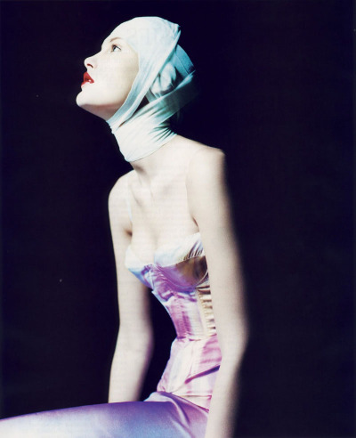
I think the image I plan on using (the very first image above) has the best lighting and it was exactly what I was going for so I'm generally pleased with the outcome I think it conveys my ideas the best in comparison to the others. I have decided that the light is symbolic of her realisation, she is looking up as though she is seeing into the light. Below is an example of the type of lighting I used in the studio. I wanted exactly the type of lighting the image has here and I feel my images are pretty close, so I am pleased with the outcome.
Why I Used These Techniques
I think the image I plan on using (the very first image above) has the best lighting and it was exactly what I was going for so I'm generally pleased with the outcome I think it conveys my ideas the best in comparison to the others. I have decided that the light is symbolic of her realisation, she is looking up as though she is seeing into the light. Below is an example of the type of lighting I used in the studio. I wanted exactly the type of lighting the image has here and I feel my images are pretty close, so I am pleased with the outcome.
Below is an example of my studio set up.


No comments:
Post a Comment